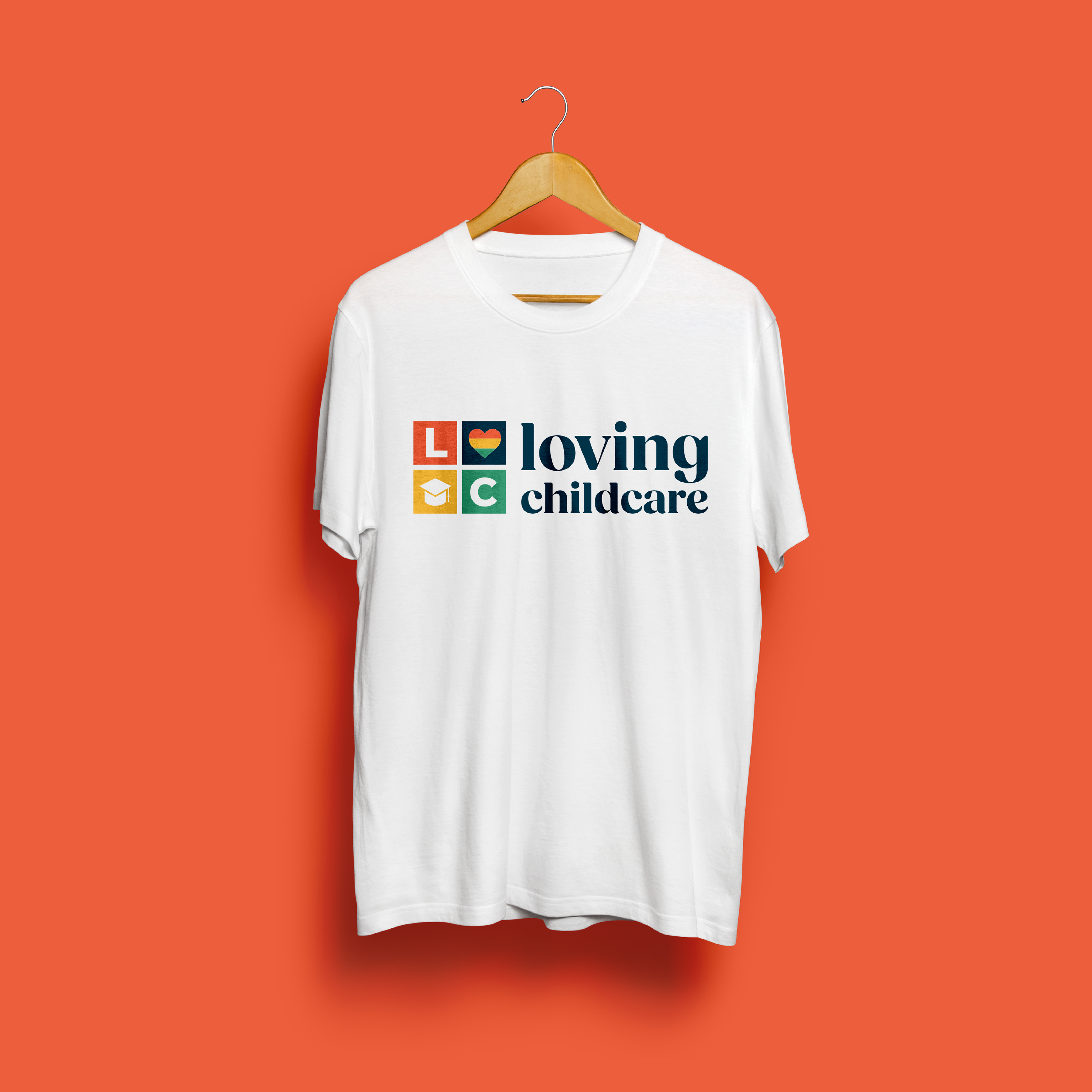
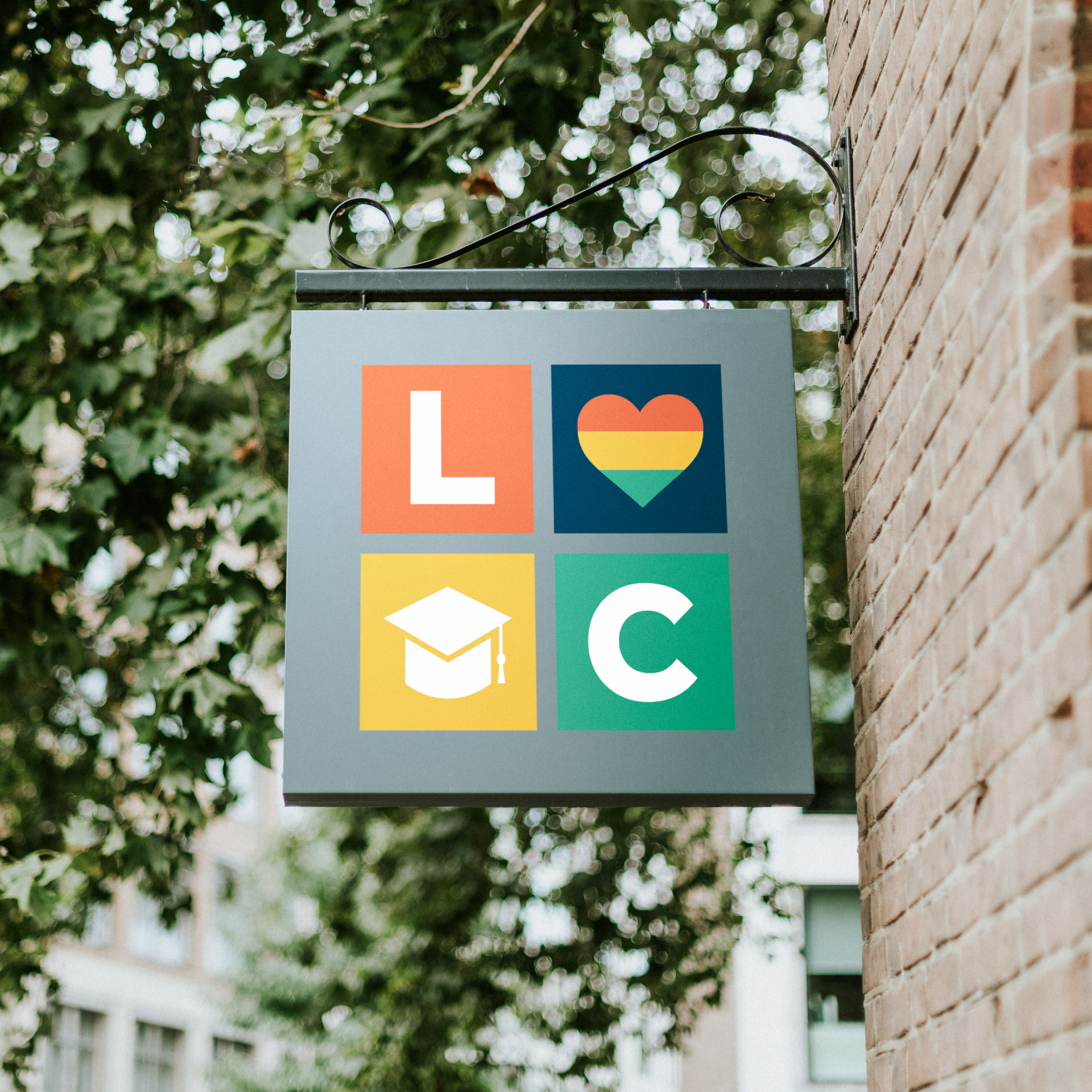

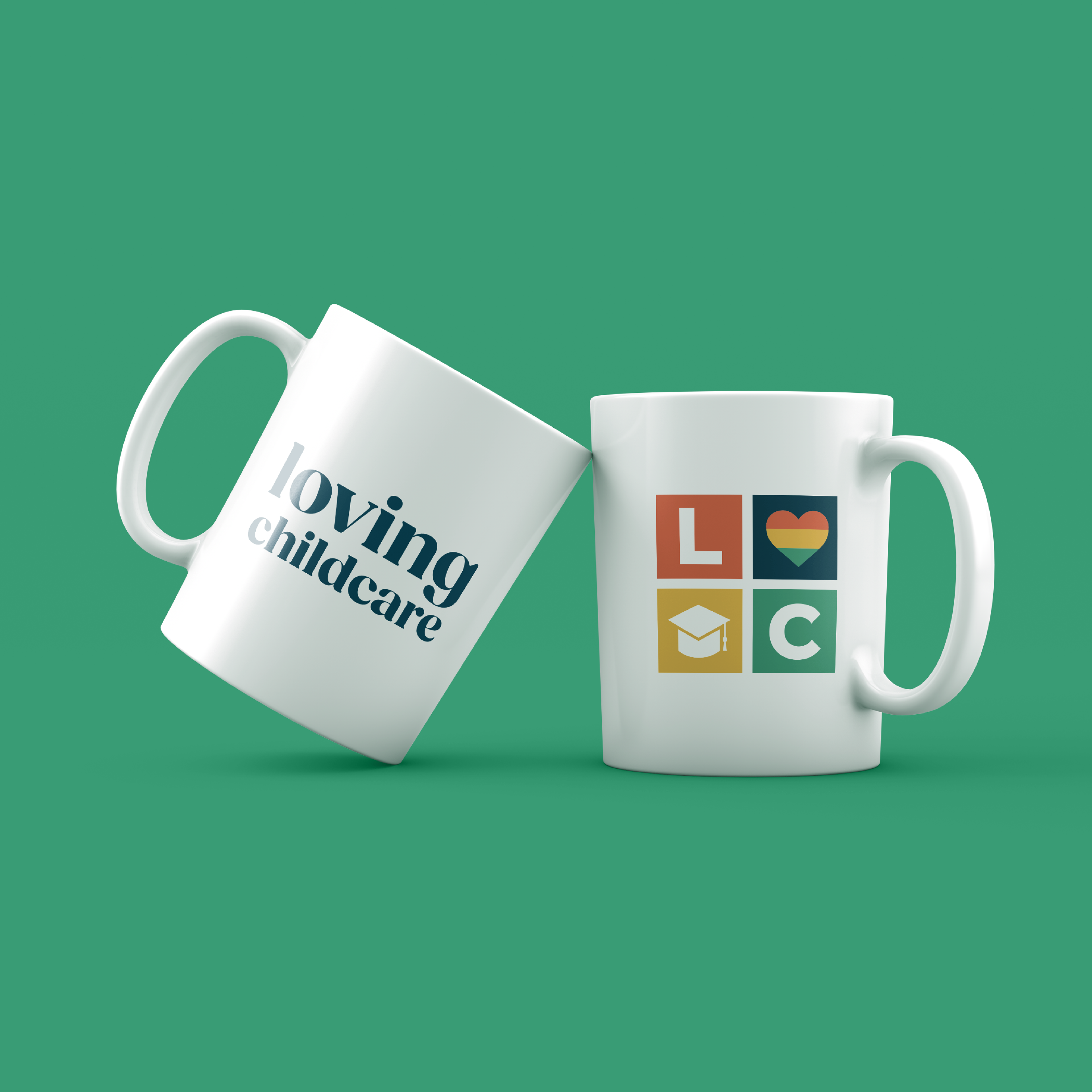
Loving Childcare is a local daycare in Chattanooga, TN that wanted to establish their brand in the community with their first logo. They are a fast growing organization, but have never had a strong digital presence. This was the beginning of their solution.
The prompt called for a clean, straight-forward design that communicated their essence: That they help prepare children for the future through education, and that they are focused on the minority community of the greater Chattanooga area.
The name used all lowercase text to convey a softer, more friendly business. The contrast of thick and thin elements in each letter also give off a playful vibe.
The colors were sampled from the Juneteenth flag, and slightly desaturated to be more gentle in tone.
Even the shape of the icon being reminiscent of the blocks we would play with as children reinforces the idea that this institution helps children develop through tactile activities to help them gain a greater understanding of our world.
